
nude figure
18x24
red and white conte on paper
12 hours
18x24
red and white conte on paper
12 hours
Last summer I took a three day 3 color chalk workshop with Rob Liberace at Studio Incamminati. In the workshop the three colors were black, red and white; in the tradition of the old masters such as Rubens, etc.. We practiced the technique with three different mediums which are pastel pencil, conte pencil and verithin pencils. I liked all three for different reasons but felt most gravitated towards the conte because they are less precise and mechanical than the verithin, and stickier or less powdery than the pastel so the drawing grabs faster (I suppose that is why pastel artists use the sandpaper surface to work on). For whatever reason I feel inclined to the conte. I also now use the conte sticks rather than the pencils because I like it being a bit clumsy and I can also use the side for large shape blocking-in or large simplified gradations. For these two conte drawings I am not using black, only red (or sanguine)and white plus a stump (a little bit for the shadow mass although you are not supposed to) and a kneeded erasure.

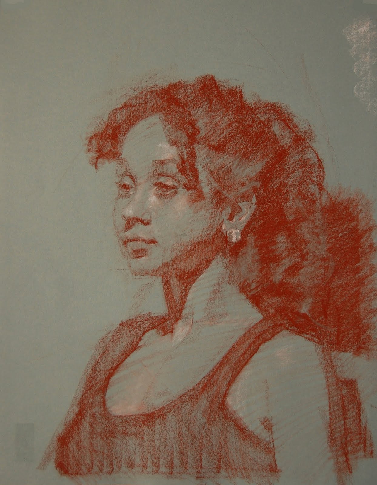
Aleena
18x24
Red and white conte on paper
3 hours
I am also learning what the medium can and cannot do. The red reaches its darkest dark very quickly so you have to have a light touch and slowly ease into your darker tones. Also the less you use the erasure the better. It would be ideal if the drawing slowly got darker as you became more certain of where things are and did not use the erasure at all. However in the earlier stages when the conte is still light, the erasure can be helpful to move the shapes or lines around a bit before committing. Once you go past a certain level of darkness, there is no going back. This is partly why I like the conte, it encourages more of a sketch mentality where you embrace the imperfections. Another lesson is that the white in the lights is to be used sparingly, mostly just the top-ish planes and highlights. I went overboard with my whites in the figure drawing, which is more apparent in real life than in this photograph. The method I have been using is sort of a hybrid between massing in tone and caligraphic lines. I am sensing now that Jon DeMartin was right when he said the red is for the shadows and dark lights, then the white is only for the lightest lights, the rest of the light mass is left open (or paper) and most of the descriptive power is in the line. So I may gravitate more towards constructing linearly and the tones secondary in future drawing, or I may continue to try to do them both equally. The old masters used certain methods because they worked, but part of the fun is also to find out what works for you.

Peter Paul Rubens - black, red and white color chalk
 Tiepolo - red and white chalk
Jon DeMartin - red and white chalk
 Robert Liberace - black, red and white chalk
 This is a black and white conte drawing I did during a Jon DeMartin workshop a few years back at Studio Incamminati. I didn't overuse the white in this one.
Beautiful!
ReplyDeleteReally lovely!
ReplyDelete